I have a problem with the cover I did for 'Red Alert' last year. It
sucks! I really hate it-- I was aiming for a sort of Lo-fi cutesiness,
deliberate amatuerishness kind of vibe. I guess that worked only too
well-- it looks like the kind of cover a child would design. I wanted to
produce something that would be dramatic and mysterious, and I was
re-reading an early issue of Savage She Hulk when I saw this page:
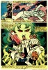
It's from the start of issue three
where Jen is having a nightmare about her first transformation into the
She-Hulk, and there's this wonderful montage image of the three thugs
from the hospital falling into Shulky's claw-like hands. It looks
awesome! And I immediately thought it would make a cool cover for Red
Alert too.
I've also been trying to make Red Alert look like something that's been sitting in a longbox since 1982. here's what I've been
wasting my time doing playing with recently:
And, because it's what you're all really here for, here are some of those money shots looking like they've been festering in a garage somewhere for 30 years:


I actually liked the cliched, gimmicky feel of the original. I think you still should have kept it!
ReplyDeleteTo be fair, the original looks like an actual title card from an animated series episode that never was. Love the new interpretation though.
ReplyDeleteBTX